SMASH!
Freelance work
motion & graphic design
promotion material
Different graphic design and motion work I created for SMASH! (Sydney Manga and Anime Show) as a volunteer. This included promotional work that was displayed across their social media platforms, print assets and digital signages which were used at the ICC on the day of the event. SMASH! is one of Sydney’s biggest annual conventions that revolves around Japanese Pop culture.
I worked under the guidance of SMASH!'s creative director to produce work that aligned with SMASH’s style guide as well as consideration to client representation for the guests they invite to their event. There was a strict brief and written copy to the projects along with tight scheduling. However, I was also given creative freedom in the direction of the work which I communicated with the different departments of SMASH! for project approval.
Credits
Character illustrations used were created by Louisa (@min_toki) and Carmen (@soulc1ty), provided by SMASH! as a resource.


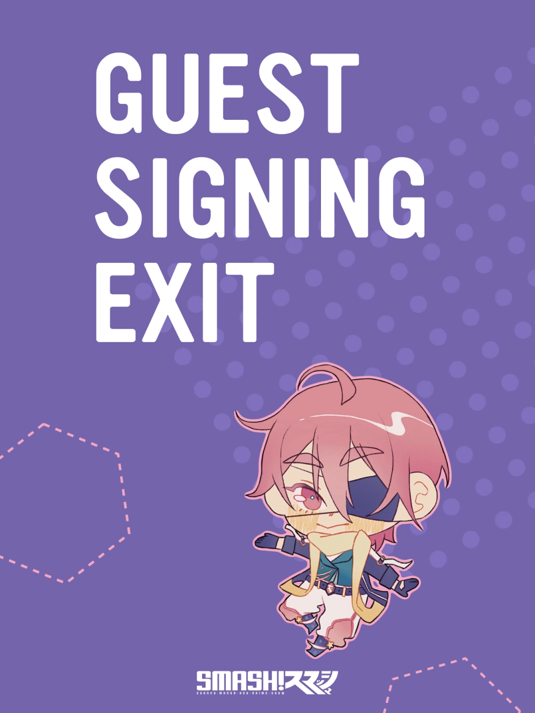
Digital signages
motion & graphic design
The job was to design motion graphic signages which would be used at ICC to inform the attendees of the different stations in the convention on the day. These were designed according to SMASH!’s style guide along with consideration of the convention context and their attendees. Therefore there was playfulness with the colour and shapes. These signs were also designed to exist as motion or static digital signages in case of any technical difficulties on the day.
Credits
Character illustrations used were created by Winny (@wiji__02) and Stefie (@unifie__ ), provided by SMASH! as a resource.


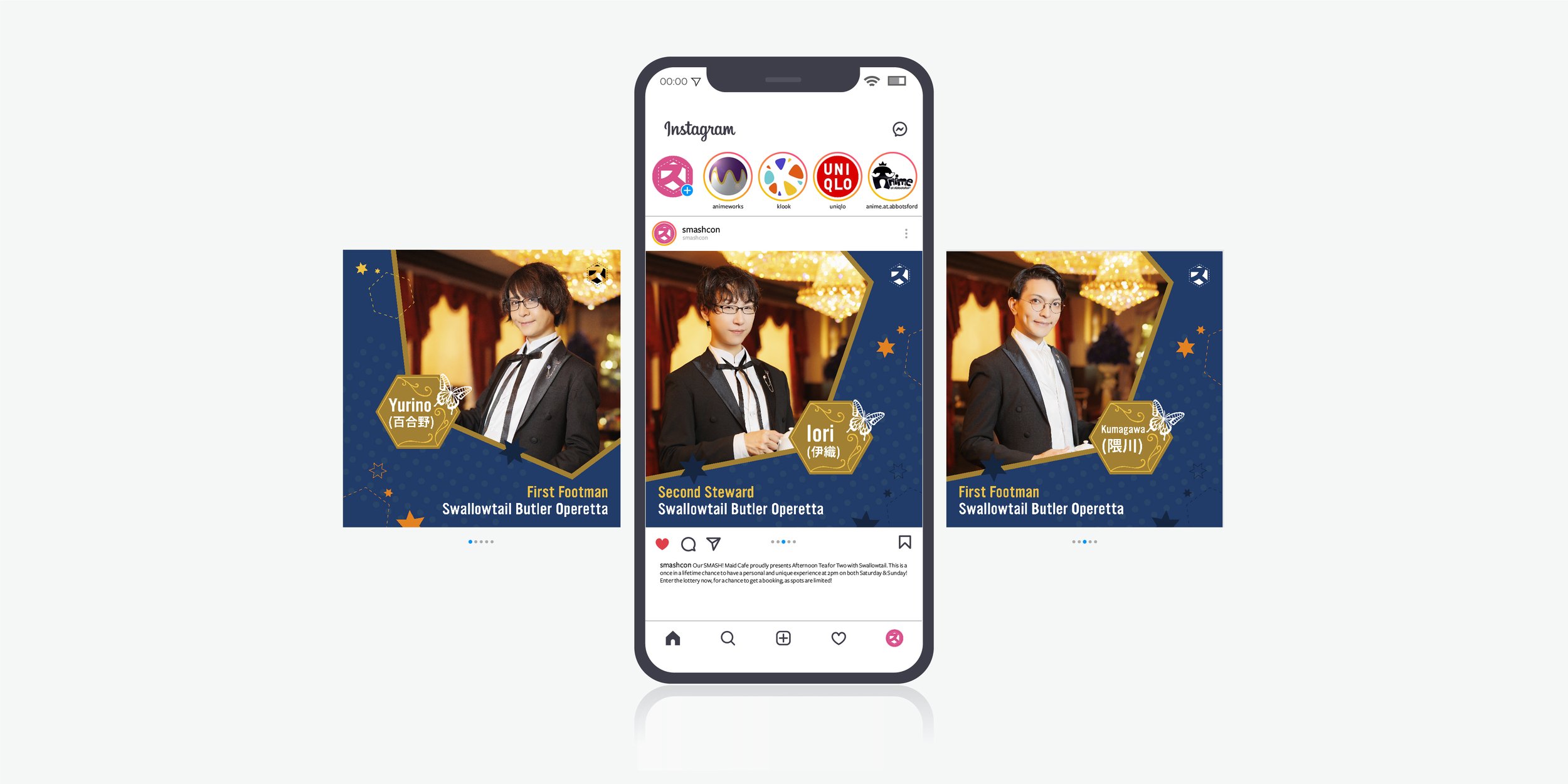
Swallowtail Social Media Promotions
motion & graphic design
A series of static and motion promotional material for SMASH! social media platforms to introduce one of their event guests, Swallowtail. The project brief was to introduce Swallowtail to garner hype and explain their involvement on the day. Photograph images and recorded video of the guests were provided. The concept and tone of this series was to focus on conveying “service and elegance” to represent Swallowtail because their brand identity differs from SMASH’s vibrant and modern visual style. While the work produced fell under SMASH’s brand identity there were also elements of Swallowtails brand values to convey accurate guest representation.